a better way to forget
Artifact
circa 2025*
A personal archivist for all your misc. saved content. Artifact quietly pulls structure and meaning from your screenshots, turning them into useful lists, smart nudges, and a searchable archive.
Role/Contributions
Lead Designer
Product Strategy and Design Direction
UX/UI User Testing
Platform
iOS
Inception
“When’s the last time you looked back in a saved posts folder?”
I screenshot and save anything and everything I find interesting. Instagram reels, Twitter threads, random articles, recipes, all fair game to be filed away with a quick press or the squeeze of a button, and all under the vague premise that they would provide some future value.
I remember watching Marie Kondo, and wondering how I’d love for her to tackle my camera roll. All the things I’d carefully stowed away, I could hardly remember why I saved them, let alone draw any sort of insights or actionable plans from them. And I’m not alone.
User Research
Workshopping this with colleagues and friends, we arrived at 4 key pain points that best described how people felt about the digital content they tended to hoard.
Screenshots, saves, disappear into the void.
➁ Each platform has it’s own ‘save’ UX.
An over-abundance of platforms leads to a bunch of orphaned folders.
➂ There’s no way to act on what you’ve saved, only to accumulate.
We save with intent, but with no clear path to return or take action.
➃ Screenshots are the most universal & low friction save tool.
But also the most chaotic and unstructured.
How might we :
Turn digital hoarding into meaningful recall?
Organize saved content with zero onboarding?
Make screenshots instantly more actionable?
User Journey :
Initially, the app took shape as a simple set of folders with tags and rules set by the user. But during the initial design sprint/user feedback session, people were less interested in the overall look (something I’d thought was crucial) and more in a throw-away thing I added in absent-mindedly. An tiny little events button that would automatically remind you of events you screenshotted.
After user testing and multiple rounds of feedback on the MVP, I realized that organization alone wasn’t enough. Users didn’t just what amounted to a pretty filing cabinet. They wanted something that nudged them, reminded them, helped them act on all the little things they accumulated and captured.
Subsequent workshopping and white-boarding sessions led to the four UX pillars that now form Artifact.

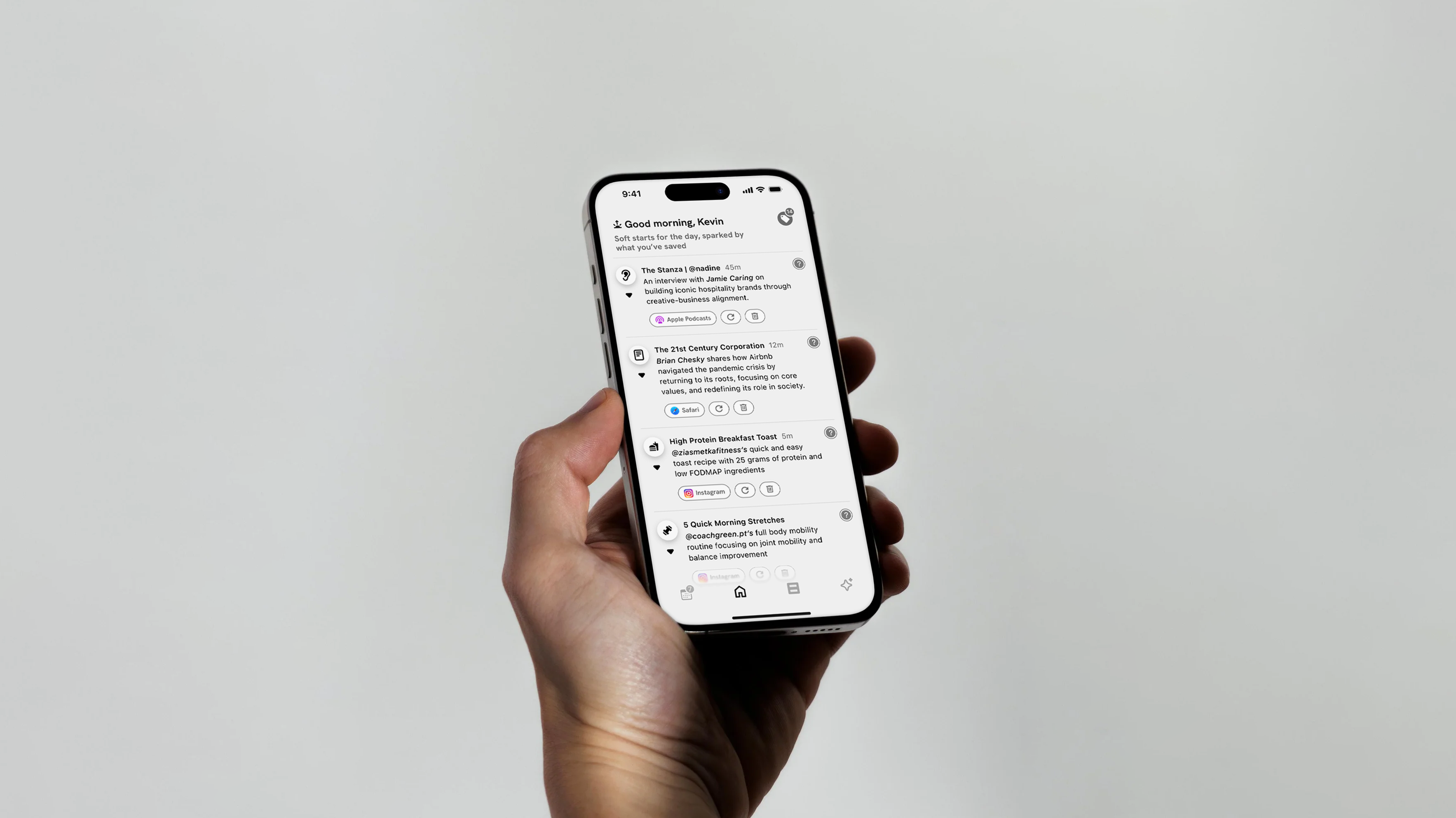
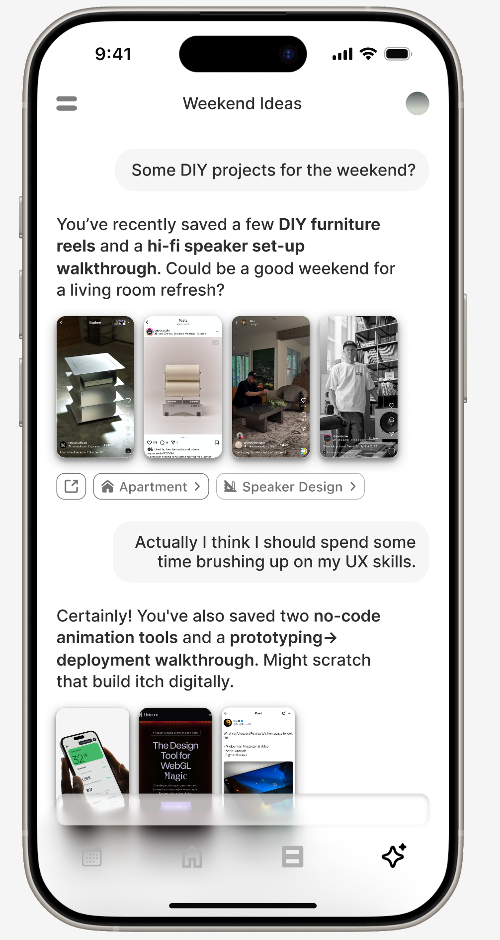
Dashboard
A home feed that shifts with your day. Contextual, time-aware, and built to surface what’s most relevant in the moment.
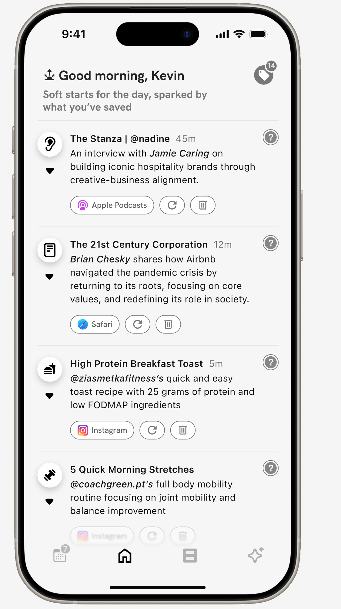


Home
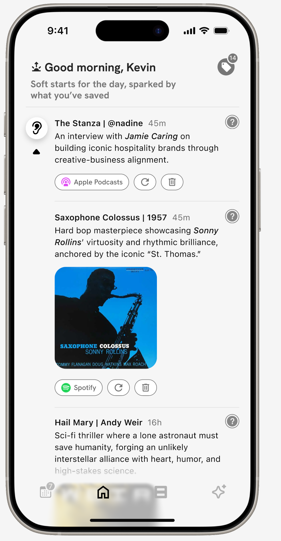

Expanded Section


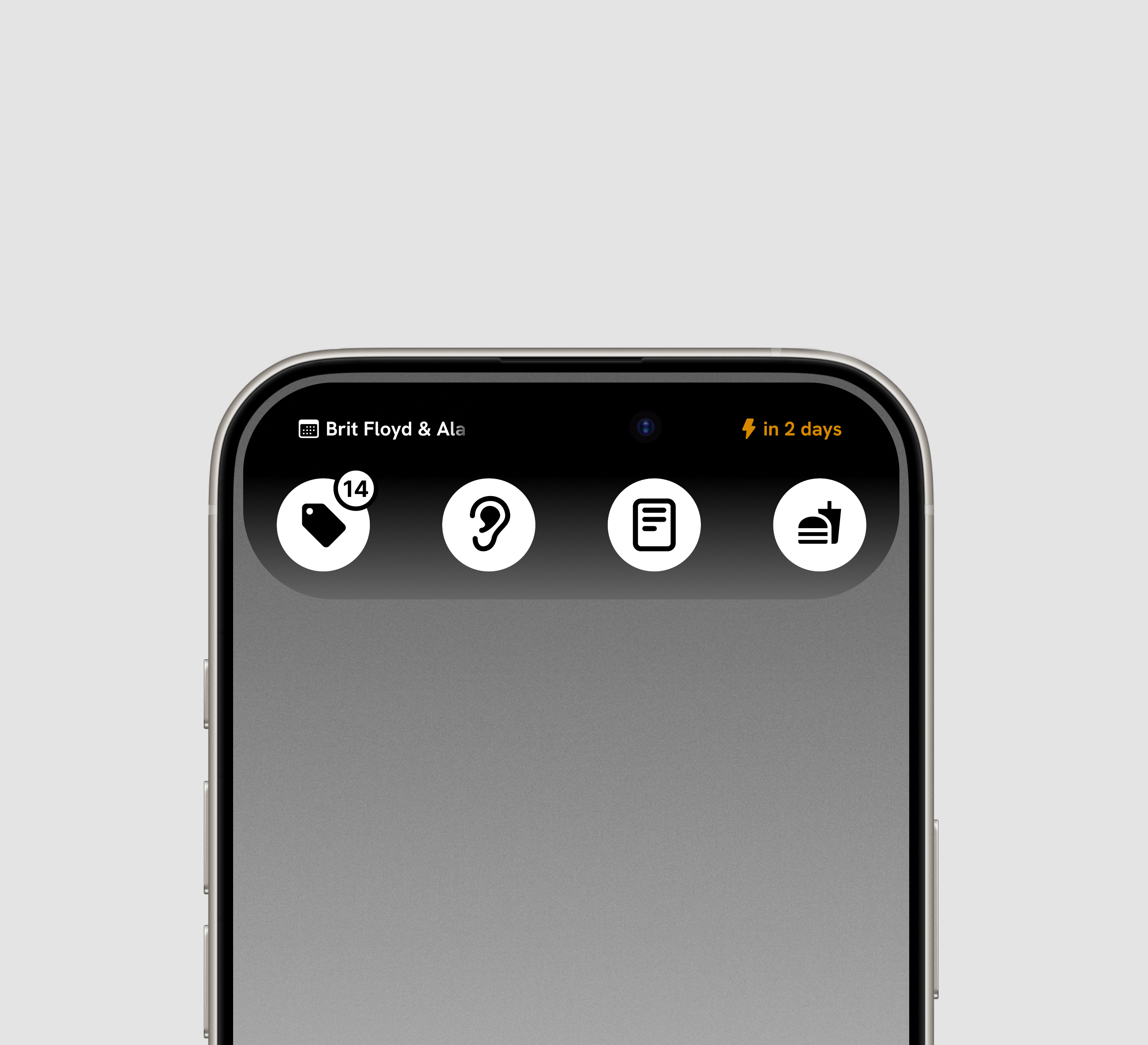
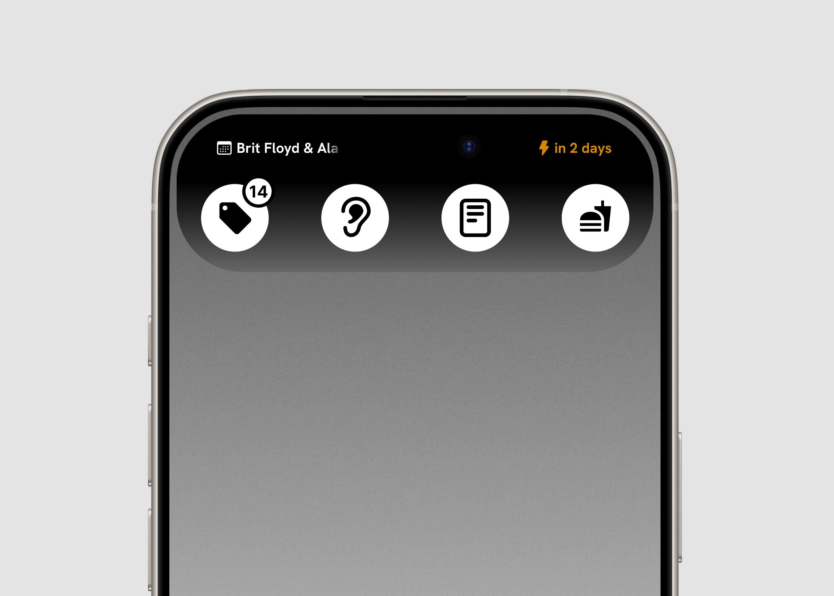
Live Calendar
Automatically detects and organizes events you’ve captured.
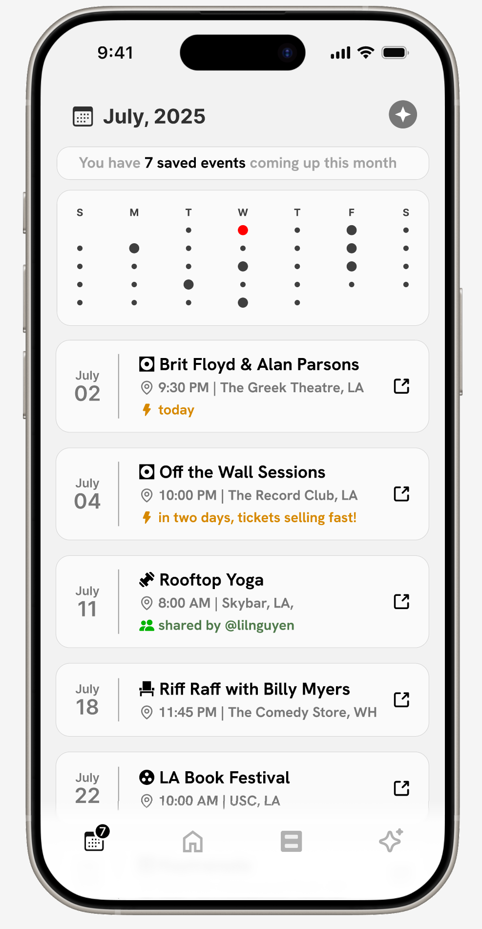
Calendar
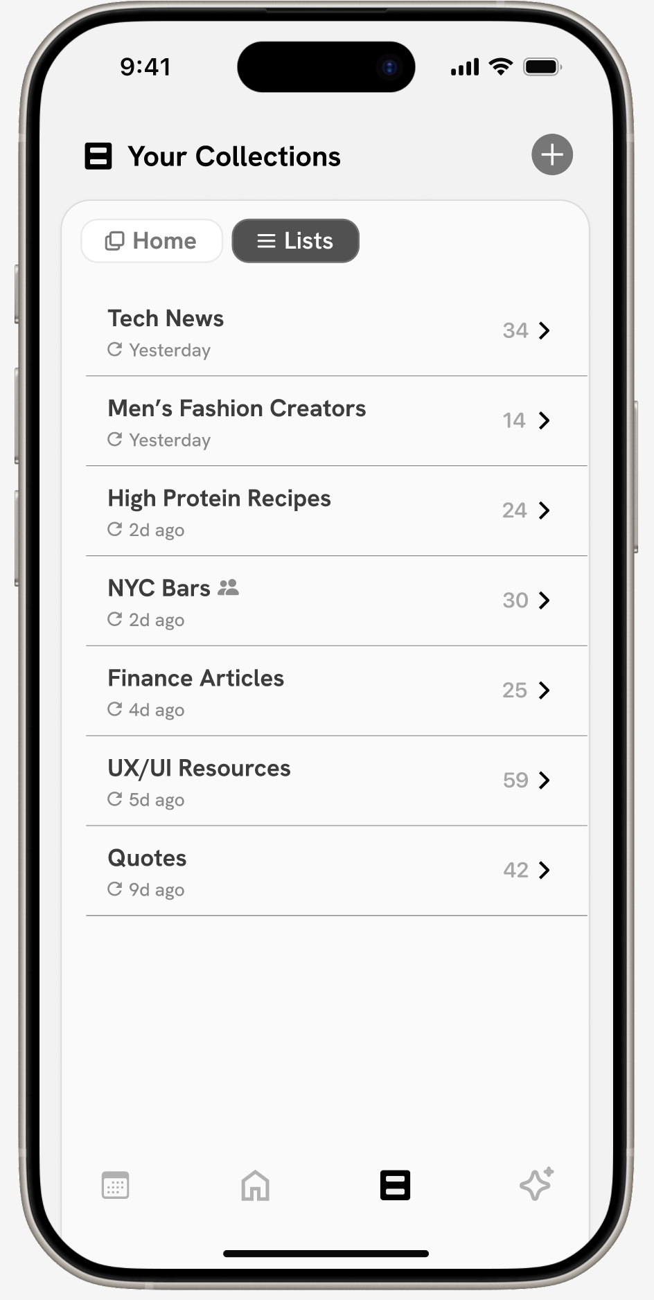
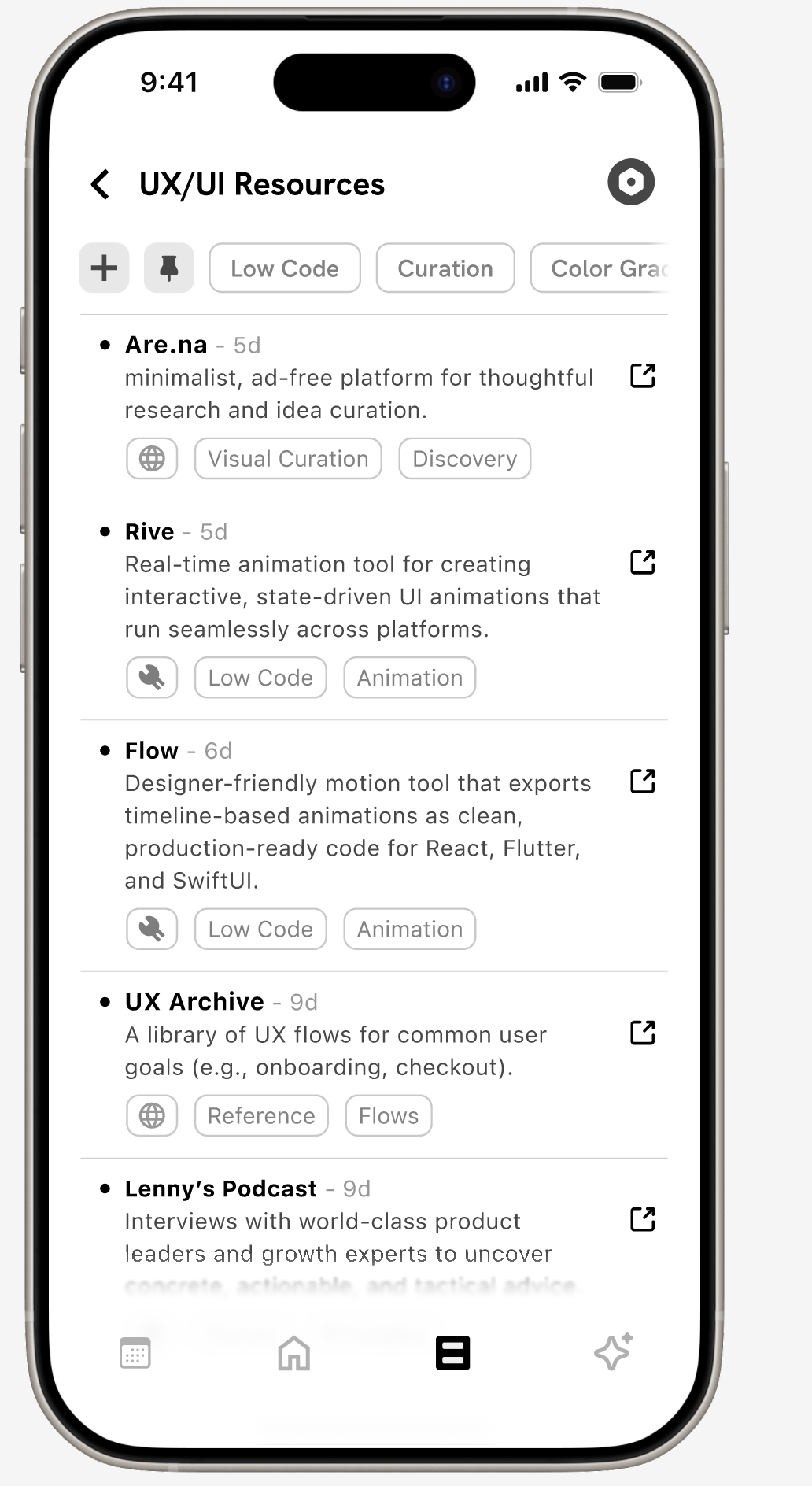
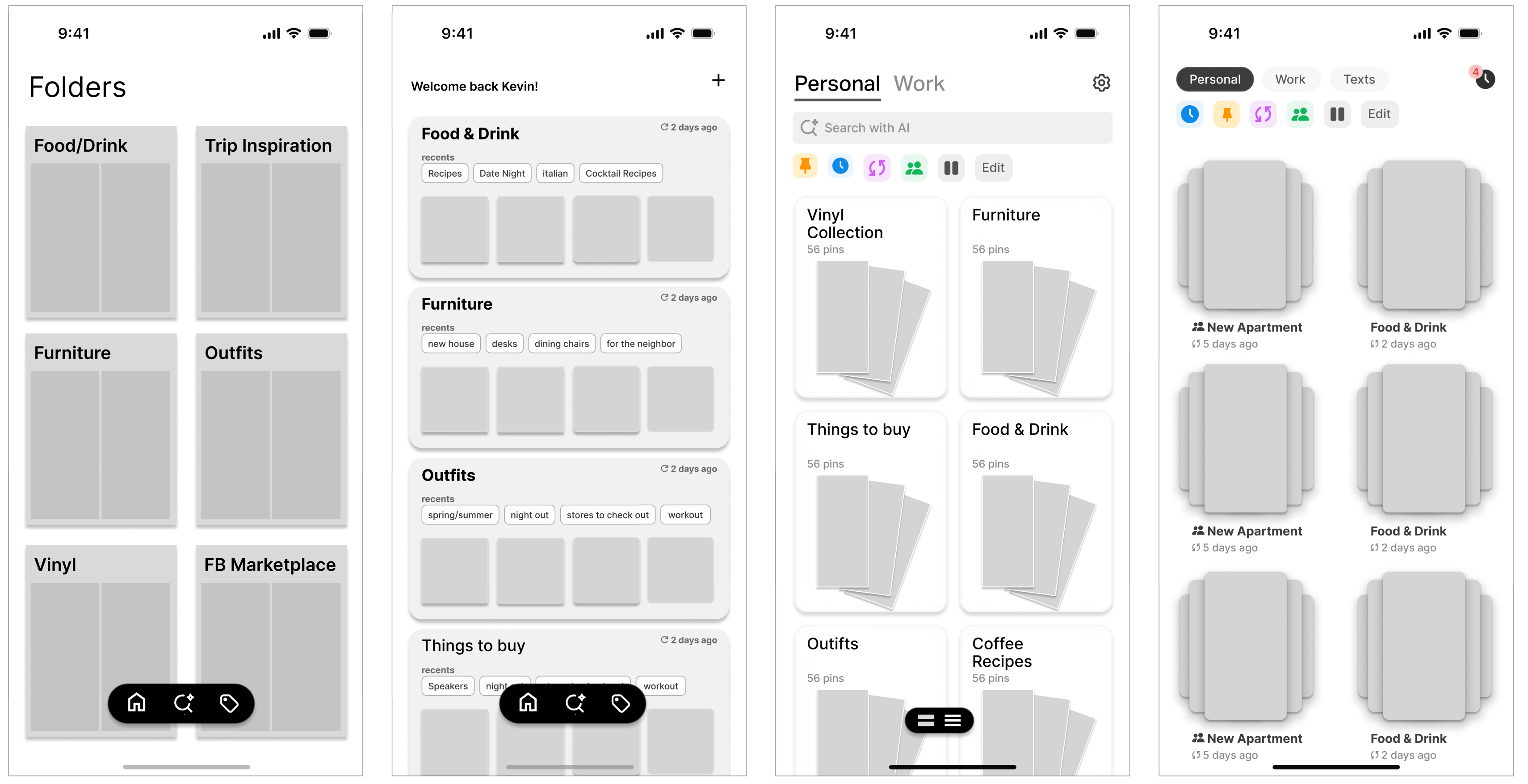
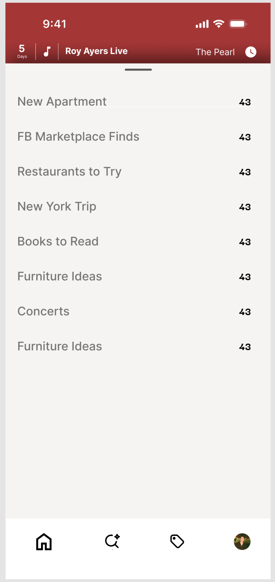
Collections
Collections are split into two modes. Visual boards for when you want to scroll, scan, and get inspired. Smart lists extract key info from images, organized into searchable, editable lists.
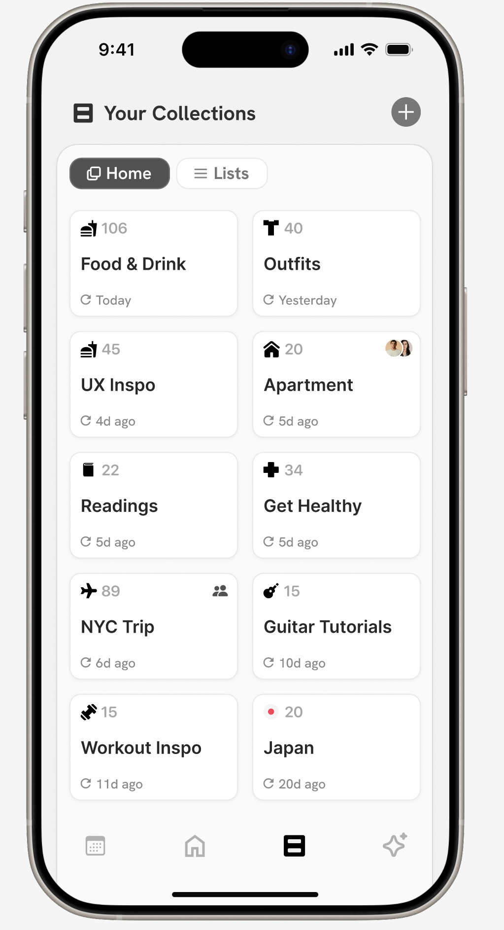
Home
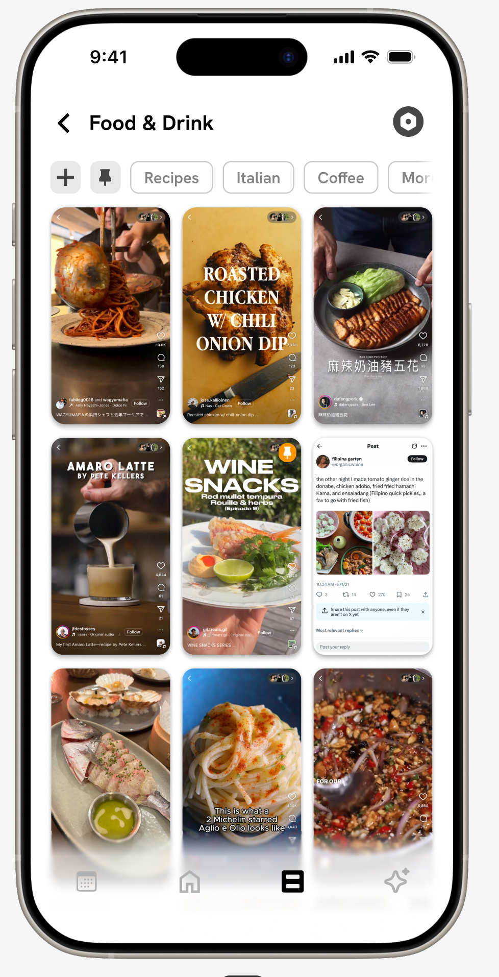
Visual Board
Home
Smart List

AI Chat
A personal perplexity layer on top of everything you’ve saved.Powered by what you found worth revisiting.
Smart List
a better way to forget
Artifact
circa 2025*
A personal archivist for all your misc. saved content. Artifact quietly pulls structure and meaning from your screenshots, turning them into useful lists, smart nudges, and a searchable archive.
Role/Contributions
Lead Designer
Product Strategy and Design Direction
UX/UI User Testing
Platform
iOS
Inception
“When’s the last time you looked back in a saved posts folder?”
I screenshot and save anything and everything I find interesting. Instagram reels, Twitter threads, random articles, recipes, all fair game to be filed away with a quick press or the squeeze of a button, and all under the vague premise that they would provide some future value.
I remember watching Marie Kondo, and wondering how I’d love for her to tackle my camera roll. All the things I’d carefully stowed away, I could hardly remember why I saved them, let alone draw any sort of insights or actionable plans from them. And I’m not alone.
User Research
Workshopping this with colleagues and friends, we arrived at 4 key pain points that best described how people felt about the digital content they tended to hoard.
Screenshots, saves, disappear into the void.
➁ Each platform has it’s own ‘save’ UX.
An over-abundance of platforms leads to a bunch of orphaned folders.
➂ There’s no way to act on what you’ve saved, only to accumulate.
We save with intent, but with no clear path to return or take action.
➃ Screenshots are the most universal & low friction save tool.
But also the most chaotic and unstructured.
How might we :
Organize saved content with zero onboarding?
Make screenshots instantly more actionable?
Turn digital hoarding into meaningful recall?
User Journey :
Initially, the app took shape as a simple set of folders with tags and rules set by the user. But during the initial design sprint/user feedback session, people were less interested in the overall look (something I’d thought was crucial) and more in a throw-away thing I added in absent-mindedly. An tiny little events button that would automatically remind you of events you screenshotted.

After user testing and multiple rounds of feedback on the MVP, I realized that organization alone wasn’t enough. Users didn’t just what amounted to a pretty filing cabinet. They wanted something that nudged them, reminded them, helped them act on all the little things they accumulated and captured.
Subsequent workshopping and white-boarding sessions led to the four UX pillars that now form Artifact.
Dashboard
A home feed that shifts with your day.
Contextual, time-aware, and built to surface what’s most relevant in the moment.
Home
Expanded Section
➀
➁
➂
➃
➄


Live Calendar
Automatically detects and organizes events you’ve captured.
➀
➁
➂
Collections
Collections are split into two modes. Visual boards for when you want to scroll, scan, and get inspired. Smart lists extract key info from images, organized into searchable, editable lists.
Home
Visual Board
➀
➁
➂
Home
Smart List
➀
➁

AI Chat
A personal perplexity layer on top of everything you’ve saved.Powered by what you found worth revisiting.
➀
a better way to forget
Artifact
circa 2025*
A personal archivist for all your misc. saved content. Artifact quietly pulls structure and meaning from your screenshots, turning them into useful lists, smart nudges, and a searchable archive.
Role/Contributions
Lead Designer
Product Strategy and Design Direction
UX/UI User Testing
Platform
iOS
Inception
“When’s the last time you looked back in a saved posts folder?”
I screenshot and save anything and everything I find interesting. Instagram reels, Twitter threads, random articles, recipes, all fair game to be filed away with a quick press or the squeeze of a button, and all under the vague premise that they would provide some future value.
I remember watching Marie Kondo, and wondering how I’d love for her to tackle my camera roll. All the things I’d carefully stowed away, I could hardly remember why I saved them, let alone draw any sort of insights or actionable plans from them. And I’m not alone.
User Research
Workshopping this with colleagues and friends, we arrived at 4 key pain points that best described how people felt about the digital content they tended to hoard.
Screenshots, saves, disappear into the void.
➁ Each platform has it’s own ‘save’ UX.
An over-abundance of platforms leads to a bunch of orphaned folders.
➂ There’s no way to act on what you’ve saved, only to accumulate.
We save with intent, but with no clear path to return or take action.
➃ Screenshots are the most universal & low friction save tool.
But also the most chaotic and unstructured.
How might we :
Organize saved content with zero onboarding?
Make screenshots instantly more actionable?
Turn digital hoarding into meaningful recall?
User Journey :
Initially, the app took shape as a simple set of folders with tags and rules set by the user. But during the initial design sprint/user feedback session, people were less interested in the overall look (something I’d thought was crucial) and more in a throw-away thing I added in absent-mindedly. An tiny little events button that would automatically remind you of events you screenshotted.
After user testing and multiple rounds of feedback on the MVP, I realized that organization alone wasn’t enough. Users didn’t just what amounted to a pretty filing cabinet. They wanted something that nudged them, reminded them, helped them act on all the little things they accumulated and captured.
Subsequent workshopping and white-boarding sessions led to the four UX pillars that now form Artifact.
Dashboard
A home feed that shifts with your day.
Contextual, time-aware, and built to surface what’s most relevant in the moment.
Home
Expanded Section
➀
➁
➂
➃
➄


Live Calendar
Automatically detects and organizes events you’ve captured.
➀
➁
➂
Collections
Collections are split into two modes. Visual boards for when you want to scroll, scan, and get inspired. Smart lists extract key info from images, organized into searchable, editable lists.
Home
Visual Board
➀
➁
➂
Home
Smart List
➀
➁

AI Chat
A personal perplexity layer on top of everything you’ve saved.Powered by what you found worth revisiting.
➀